
What is a Building Block?
Building Blocks are coded UI components designed to be dropped into Foundation projects. Many Building Blocks are based on tried and true patterns that we’ve used in our client projects over the last five years at ZURB using Foundation. We also have community Building Blocks too!
Building Blocks are:
- HTML, CSS, and JS snippets that work in any standard Foundation project
- Lightly styled components
- Easy to extend or customize
- Common solutions to layout or component challenges that are not core to the Framework
Building Blocks are NOT:
- Templates
- Themes
- Overly stylized
- Code that does not integrate with Foundation
In short: The intent of Building Blocks are to solve common patterns, scaffold faster, and integrate with your existing styles right out of the box.
How To Use a Building Block
Building Blocks are easy to use in your projects whether you’re using a CSS version or the powerful ZURB Stack. Below, we’ve outlined how to get a Building Block into your project in a snap and build faster.
(Option 1) Foundation CLI Install
This is where a powerful workflow like the ZURB Stack really ups your game. You want to add a Building Block to your project to show an interaction or build a page in record time. Imagine if you could add a Building Block or even an entire kit of Building Blocks to your site with a single command. You don’t have to imagine because an update to the Foundation CLI allows you to do just that.
Foundation’s CLI install will:
- Create you a Panini HTML partial with the Building Block’s HTML
- Create you a SCSS partial with the Building Block’s SCSS and also add the @import for you in your app.scss file.
- Create a JS file with the Building Block’s JS and link it up in the config.yml
Bam! Add your Panini partial in your page or layout and now you’re cookin’.
In your terminal, make sure you’re in you ZURB Stack project and have the Foundation CLI installed.
The available commands are:
foundation blocks list- List out the names of all the available Building Blocks. It’s a lot!foundation blocks install [blockname]- installs an individual Building Blockfoundation kits list- List out the names of all the available Building Block kits.foundation kits install [kitname]- installs all the Building Blocks in the kit
You'll need the latest version of the Foundation CLI (Foundation CLI version 2.2.1) to access these commands. See upgrade instructions in the accordion below.
Not sure what version Foundation CLI you have? Run:
foundation -v-
Installing the Foundation CLI
Need help installing the Foundation CLI? We've put together some tutorials to get you going.

Installing the Foundation CLI to Automate Sass Projects
Installing Foundation CLI on Windows
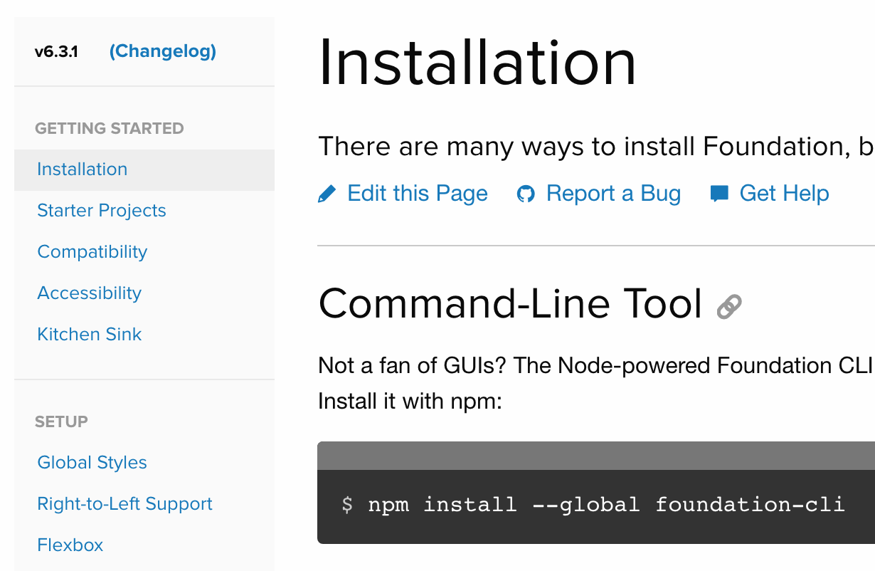
Foundation Docs: CLI Installation
-
How to update the Foundation CLI
If you already have the Foundation CLI installed, you'll want to upgrade to the latest one to get the Building Block CLI feature.
Step one: Uninstall the old Foundation CLI.
npm uninstall -g foundation-cliStep two: Install the new Foundation CLI.
npm install -g foundation-cliThat's it!
** Depending on how your machine is configured, the command may fail with an EACCESS error. To get around this, run the command with sudo at the beginning:
sudo npm install --global foundation-cli - ZURB Stack and Panini

(Option 2) Copy it
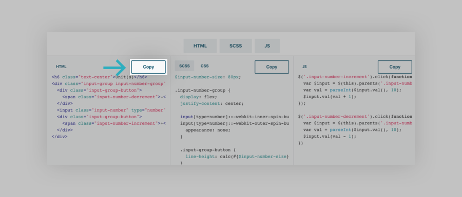
Like a Building Block? You can copy the HTML and CSS/SCSS and JS (if applicable) from the Building Block detail page. You’ll see a responsive preview and description at the top of the page. Below the preview you’ll find the code for the component.
The HTML, CSS, and JS toggles let you focus on one section at a time if you’d like.
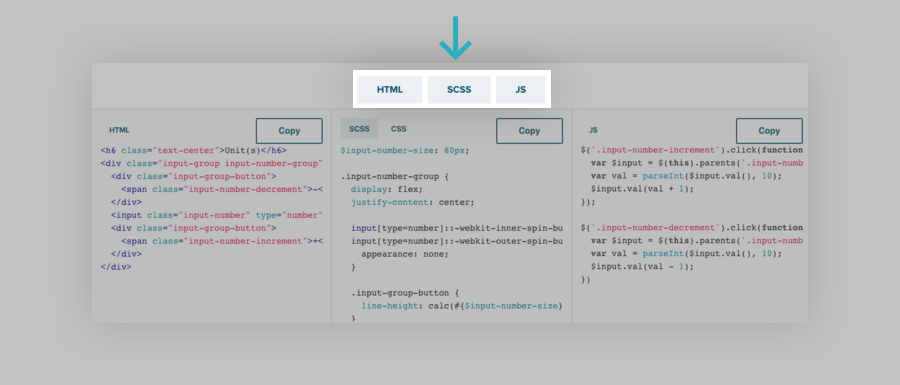
You can copy the the code from each code container using the handy copy button.
If you are using CSS vs SCSS, you can toggle to the compiled CSS using this handy toggle:
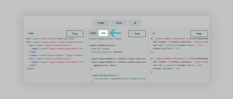
If you’re using the CSS version of Foundation, it’s best to add the CSS to your app.css file that is included with the downloaded Foundation CSS project. You can make any style overrides from there.
If you’re using the ZURB Stack Sass version, a custom SCSS partial is the best place to add the Building Block’s SCSS. The JS can be added to app.js. But if you’re a fan of optimization, we suggest you use the Foundation CLI install to do all this automatically for you. It’s rad!
(Option 3) Download an individual Building Block
You can can download the files needed for the Building Block. Click the download button and you’ll get:
- Individual HTML files
- Individual CSS files for each
- Individual SCSS files in case you want to manually add them to a Sass project
- Individual JS files (if applicable)
(Option 4) Download a Building Block Kit
Looking to start with a Building Block kit? Kits are large collections of Building Blocks that are matched to each other for a specific type of Site, App, or use case. To save you time over the copy/paste method of individual Building Blocks, you can download a zip file of the kit. For each Building Block, it will come with:
- Individual HTML files
- Individual CSS files for each
- Individual SCSS files in case you want to manually add them to a Sass project
- Individual JS files (if applicable)
Again, if you’re using the ZURB Stack, the Foundation CLI can do this for you.
Dependencies
Building Blocks are made to drop into any Foundation project and work. Therefore Foundation is a dependency (needs it to work as expected).
Since Foundation’s interactive components are build using jQuery, jQuery is a dependency. Every Foundation download or Install comes with this. jQuery is not required for CSS/SCSS only components or non-js components in Foundation.
Some Building Blocks use icon fonts to make them look nicer or convey intention. You can use the same icon fonts by adding them to your project.
You can download FontAwesome icons here:
//fontawesome.io/
Or add this CDN to the head of your pages or layout:
<link href="https://cdnjs.cloudflare.com/ajax/libs/font-awesome/4.7.0/css/font-awesome.css" rel="stylesheet">How do I submit a building block?
So you want to build a Building Block? Well fear not! You can get in on the action too and get your work featured! We’ve put together a simple guide to submitting a Building Block. Once it’s submitted, we’ll promote your awesomeness to the greater Foundation community because you rock!
The Building Blocks site is open source just like Foundation, meaning anyone can contribute to it. It’s built on the same Node based build system the ZURB Stack is built on. Submissions are made through GitHub, with pull requests.
You’ll need:
- A sweet Building Block idea
- A GitHub account
Your computer needs:
- NodeJS (6.10.1)
- Clone or download the repo from here: https://github.com/zurb/building-blocks
Using your terminal, change directory into the building-blocks project and run:
cd building-blocksThen,
npm installbower installOnce the install is complete, in the project directory, you can start the project and have it watch for changes. Run:
npm startThis will start the build system and watch for changes. When you save a change, the browser preview will refresh automatically. That’s it for setup!
Submitting your Building Block
There are just a few simple files needed to submit your Building Block.
- HTML: Every Building Block will need an HTML file to demonstrate the uniqueness of the component or layout.
- SCSS: You’ll add your custom styles in a SCSS file. You only need your additional styles as Foundation is already being imported for you. SCSS files accept CSS or SCSS so you can format it either way.
- JS: If your component uses custom JavaScript/jQuery you’ll create a JS file and add it there. Again, Foundation JS and jQuery are already included, so only your custom JS is needed if you used any.
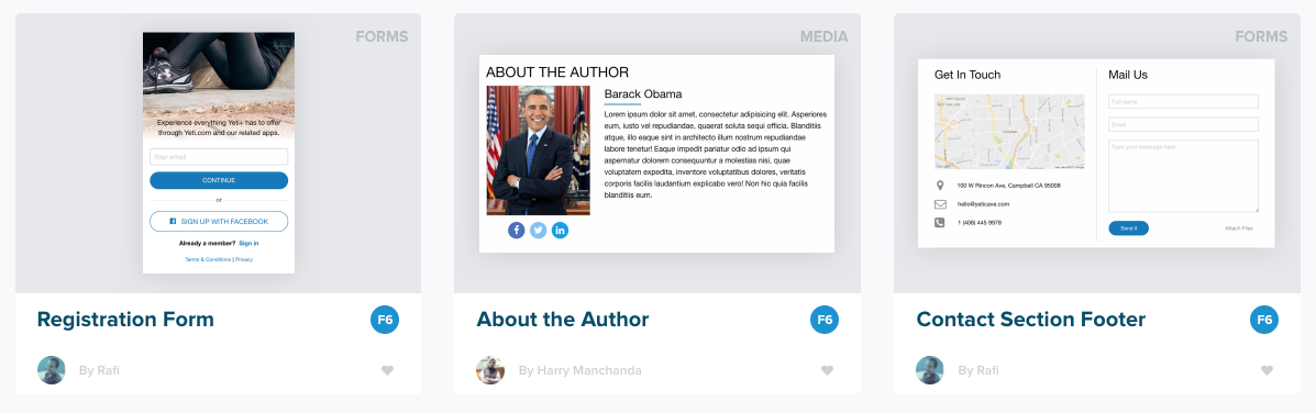
- Image: A preview image of your Building Block. This will give people context on what the building block is! See suggestions for great preview images. The thumbnail should be in a
.pngformat. - YML: You’ll want to describe your Building Block and submit your name. A Yaml file uses a
.ymlfile extension and is where the Building Block name, description, tags and more are stored. - Optional Layout HTML or SCSS: The Building Block should a stand-alone component that comes with no extra grid markup or containers. You can use an optional layout file to display the Blocks in a nicer way. See example below.
You’ll find the building-blocks folder in the root directory of the Building Blocks project. This is where all the Building Blocks that get displayed on the site live.
(Step 1) Create a New Branch:
Create a branch from which to submit your Building Block from. This will allow you to submit a Pull Request when you’re done so that the Foundation team can review it, offer suggestions and merge it in.
In your terminal, checkout a new branch
git checkout -b your-branch-name
(Step 2) Create a New, Unique Folder:
Create a new folder in the Building Blocks folder. Name it the name of your Building Block.
The name should contain the component or type of component it is. For example a card should have Card in the name or a sidebar layout should have Sidebar in the name.
Example: article-card
All your files in the folder will have the same root name
- article-card
- article-card.html
- article-card.scss
- article-card.js
- article-card.png
- article-card.yml
(Step 3) Add your Block:
In your Building Block component folder, create your .html, .scss, .js and .yml pages.
- Create a HTML file
- Example: article-card.html
- Paste in your HTML
- Save
- Create a SCSS file
- Example: article-card.scss
- Paste in your SCSS or CSS
- Save
- Create an JS file (if applicable)
- Example: article-card.js
- Paste in your JS
- Save
- Create an YML file
- Example: article-card.yml
- Fill out your yml data
- Save
- Here is a .yml file template you can use: Sample .yml file
- Make sure to add meaningful tags. See tag details below.
- Add your preview image
- Example: article-card.png
- Add the image to the
article-cardfolder for this example. - See image guidelines
Tags are important for many reasons. They not only tell people about the Building Blocks, but they also help people find others like it.
To make it easy, we put together a list of tags to use. You'll find the tag list here: //zurb.us/2oND1JR
That’s it!
You can preview your new Building Block on the homepage or go directly to it.
Example URL: //localhost:8000/blocks/article-card.html
Optional Layout HTML or SCSS files.
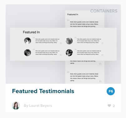
If needed, Building Blocks can have an optional layout file that helps you display your Building Blocks preview in a certain way, repeat the component, or inside a container. For example, our Article Card is one single card that fills the width of the container it's in. In order to keep it to a certain width and to repeat it several times without adding a ton of markup to the Article Card itself, we'll add a layout.html file.
Create a layout.html file inside your Building Blocks folder. So for our example, it will go in the article-card folder.
Example:
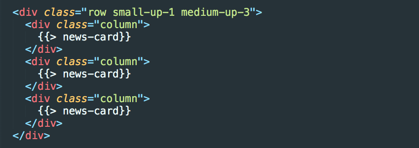
Here we used a Block Grid and included our Building Block 3 times, one for each column. You can use the Panini handlebars include like this or paste the HTML in.
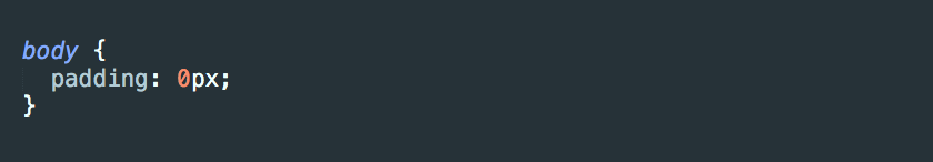
You may need some CSS to ensure your Building Block demo looks as good as possible. In that case you may create a layout.scss file to add custom styles.
Example:
Note: adding a layout.html file will override the containerClass variable in your .yml file.
Looking good?
(Step 4) Submit It!:
Now it’s time to submit your Building Block. Make sure to add and commit your work. Then submit your Pull Request.
Review Process
Once you submit your Building Block pull request, a member of the Foundation team will review it to add it in.
Things we’ll be looking for:
- An image
- The Building Block meets class naming guidelines
- The Building Block is responsive
- The
.ymlfile has the proper tags and description.
Lastly, we merge in your Pull Request and you become a legend!
How do I create a building block?
Preview Images
In order to make sure all the preview images look consistant and represent your Building Blocks well, we put together some guidelines for submitting a good preview image. These are the images that belong in the cards on the Building Blocks search results.
Example of a good preview image:
Take a screenshot of your building block with a background of #E6E8EB
In your favorite image editing program, make an artboard with dimensions of 370x255, and set the background to the color to #E6E8EB
Import the screenshot you took, and do your best to center it, while keeping it to about 80% of the width of the artboard
Note: if the height is extra long, its ok to let it overflow off the artboard as long as you emphasize the most important part
Optional but nice to have:
Bonus: If you can crop your screenshot so that no background is showing, you can make it look nicer a bit of box shadow. Set a box shadow of 3px in the y direction with 50 spread (blur radius). The color is Black (0,0,0) with an 11% opacity.
If your building block has multiple states and would be hard to explain with just one image, take an image of the extra states and layer it on top of the first image so the important components of both are showing.
Example:
Export the image into the folder of your building block, naming it the same name as the folder name.