Responsive Tables
Our way of dealing with tabular data on smaller screens. A unique method to get tabular data to fit on any screen size. This simple JS/CSS combo will let your tables adapt to small device screens without everything going to hell.
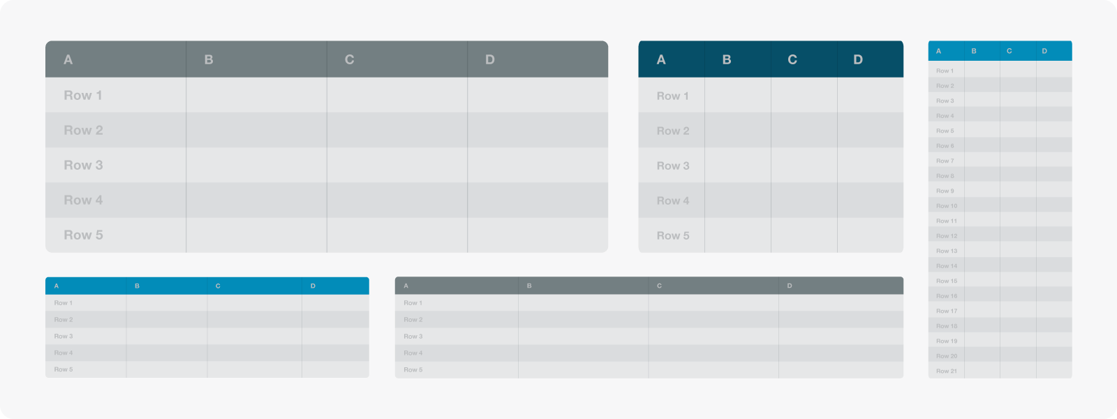
Tables and Responsive Can Live Together
Don't let tables break your responsive layout anymore. This simple JS/CSS combo will let your tables adapt to small device screens without everything going to hell. It works by taking the first column and "pinning" it to the left of the table, allowing you to scroll the other columns under it. You don't lose the likely key for each row, but you also don't have to break your nice responsive layout.
Download the code from the PlaygroundNot Tested in 5
We made these add-ons to be pretty robust, but they have not been tested in Foundation 5 yet. Watch out for gremlins if you're using Icon Fonts, Responsive Tables or the SVG Social Icons with Foundation 5.