Tips & Tricks
We've put together some Responsive Emails Tips & Tricks that will help you navigate the mine field that is coding HTML emails.
Coding responsive emails can be a real pain. This guide will help you through some of the the most common issues you'd face. It's a living document and will get updates periodically.
Why Foundation for Emails
Most responsive emails are built on templates. They’re simple, easy to drop content into and are usually well-tested. Templates have a serious cost though. "Oh, so you want to do anything other than change the colors and text?" Sorry … you’re out of luck, Chuck. Templates tend to be hard to customize heavily or to extend. For that you need a framework.
A framework is a collection of reusable code and design patterns which gives users a solid, tested base upon which to build. Not a bunch of visual styles you can just bolt on as an afterthought and call it a day.
- Frameworks give you the solid base of a template, but the extensibility of custom code. You can make your template fit your content, not the other way around.
- Additionally, a framework gives you a common codebase to structure your projects around. So if new team members work on the project, they don't have to re-invent the wheel. You can spend less time coding your email and more time optimizing your campaigns.
Need to know
The sad truth about creating or coding HTML emails is that tables are the only things that are universally supported when it comes to email design. If you came from the world of building websites, this may seem like a stepping into Doc Brown's Delorean, charging up the Flux-capacitor, and going back to the year 1996. Suddenly your CSS is written with inline style tags, useful CSS properties don't work and you're burried in a sea of table tags.
It's not all doom and gloom though, and we're all in this together. Foundation for Emails helps by getting you away from tables (Sass version), helping you with an organized project structure, and a well tested codebase to make this much easier. We've put together this guide and links to resources from our friends to help you along as well as a new Responsive Emails master class to become a HTML email pro.
HTML
Email Container Width
The email equivalent of the browser window is the "viewport", or the area in an email client dedicated to showing the actual email. This varies quite a bit.
Foundation for Emails' default container with around 600px wide. That's because the majority of email clients have a preview pane that is around 550-700 pixels. With the Sass version, you can easily customize this width by adjusting the $global-width variable.
The height of your email doesn't matter as much because people scroll. It still helps to have your most compelling content towards the top.
Structure and alignment:
When it comes to making emails, divs aren’t a thing. Don’t kill the messenger, but it’s true. It's not fun finding out we can't just use a <div> with auto left and right margins for centering, or background colors; it won't work with most email clients. <div>'s can still be used for targeting CSS and for grouping semantically related elements, but shouldn’t be used for structural purposes or spacing.
Instead, you can use the <wrapper> Inky tag to create background colors and target elements inside. More on Wrapper →
Use tables instead. For those of you who haven’t used tables since Netscape Navigator (or ever) here’s a quick recap.
There are three main tags in a table.
<table>
  <tr>
    <td></td>
  </tr>
</table>
The <table> tag wraps the entire table. The <tr> tag denotes a row. The <td> tag is used to wrap a table cell.
Some web browsers may be forgiving, but it’s important to include all three tags. Don’t get lazy and skip the <tr>. Email clients can be unpredictable, so the first step to good rendering is to have valid markup.
It makes debugging and sharing code a lot easier when you’re consistent. It lets other developers get oriented within the code and makes it easier to tell what you’re looking at, just like consistent indentation and comments.
While semantic, the “table row” and “table data” elements aren’t that helpful for creating row and column layouts. They’re designed for spreadsheets or other non-uniform grids. They can’t be used structurally.
Instead, we use nested tables. Think a bunch of single-cell spreadsheets being nested.
Where we would have divs in website land…
<div class="row">
  <div class="small-12 columns">
    <!-- Content -->
  </div>
</div>
…we have tables in email world.
<table class="row">
  <tbody>
    <tr>
      <th class="small-12 columns first last">
        <table>
          <tr>
            <th>
              <!-- Content -->
            </th>
            <th class="expander"></th>
          </tr>
        </table>
      </th>
    </tr>
  </tbody>
</table>
Table elements have their own special “display” values. Sometimes we can override them to display as block elements, but more on that later. The display value (in combination with the HTML schema specified in the DOCTYPE), specifies the rules for rendering each element.
Tables have all sorts of fancy HTML attributes…not all of which can be set in CSS. This is unfortunate because separation of concerns dictates that we should try and keep our structure in the markup (HTML) and styles in the CSS. Some inliners will take care of this for you.
<table align="center" valign="top" cellspacing="0">
  …
</table>
Speaking of CSS, you should only set classes and IDs on tables or <td> tags, not <tr> tags. If you need to apply padding, only do that on a <td> as well. Been there, done that — we had a lot of trouble with this while building the first version of Foundation for Emails. Your milage may vary, but just trying to help you out by saving you some time.
CSS
CSS Support
Support of CSS properties varies greatly between email clients. You're best off sticking with the basics and not getting too fancy.
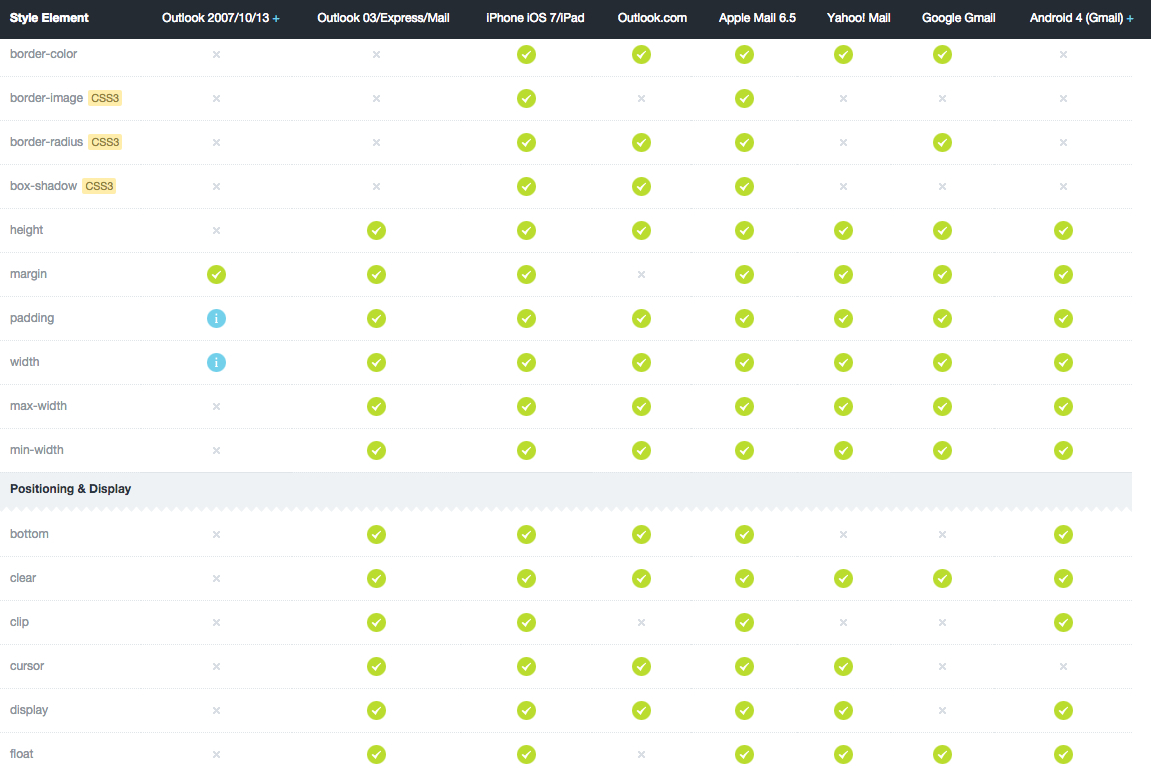
This CSS compatibility chart will really save you some pain when writing CSS: CSS Support Chart
For some things you can do and work-arounds, see the Progressive Enhancement section below.
Inlining CSS
Gmail strips the <head> (and, consequently, <style>) tags from your email. Therefore your email's CSS needs to be inlined. You know, like old school CSS:
<table class="menu" style="padding:0;text-align:center;vertical-align:top;width:auto">Because media queries cannot be inlined, they need to be moved into the <body> of the email. Our inliner does that for you.
If you're using Sass with the Foundation stack, you enjoy the luxury of automatic inlining when running npm run build. Your file will be copied into the dist folder where you will find it minified and inlined. You'll want to do this before you test or send your email.
If you are using the CSS version, you can use our web inliner.
Margin and Padding:
- Outlook 2007, 2010, and 2013 does not support "padding" in
<p>,<div>or<a>tags. Use margin instead. - Forget about using CSS positioning like
top,bottom,relative,absolute. - Margin is universally supported BUT you may see some inconsistencies in Outlook 2007, 2010, and 2013. Padding is safer. Also, it is known that Outlook.com does not support the margin property. The odd thing is Outlook.com does support margin with a capital "M". Use it like this:
margin: 10px;
Margin: 10px; // fallback for Outlook.com<br>tags are ok, but you won't get pixel perfect results and you can quickly fill up your code with messyness.- Your best option for vertical spacing is to use the
<spacer>component in Foundation for Emails. It works consistently on all email clients and lets you set the height with the size attribute. So<spacer size="32"></spacer>will create 32px of vertical space.
Colors:
- It's better to use full 6 digit hex codes colors in HTML emails (#ffffff vs #fff). Although all the major email clients support short hex colors, Outlook.com (Hotmail), Lotus Notes 6.5, 7 and 8 do not.
- RGB's are supported all the major email clients but RGBA's are only supported in IOS, Apple Mail, Gmail, and Android 4 (Gmail).
- Background colors work across all email clients as well as color for fonts.
- iOS devices sometimes render dates/times and phone numbers in blue irrespective of CSS declarations. A good workaround is to include the the CSS snippet from https://removebluelinks.com/ in combination with wrapping the affected content with
<font color="XXXXXX"></font>to ensure it gets rendered in the color required.
JavaScript
Nope. JavaScript is not a reality in most popular emails. It will be blocked for security reasons.
Images
Blocked Images
Beware of blocked images. Many email clients block images by default. “Many” being pretty much everybody except Apple Mail/iOS and Gmail. When this happens, email clients offer an option to display images but you're relying on your customer to know this.
Q: What’s a designer to do?
A: Always use an ALT tag.
ALT tags are very important for accessibility. They will show when images are blocked so your customers can tell an image is supposed to be there.
<img height=“390” width=“580” src=“hero.jpg” alt=“ALT tags are important for accessibility *and* overprotective mail clients” />Some clients even let you style the ALT text.
To style ALT text, place your font styles inline on the image.
<img height=“390” width=“580” src=“hero.jpg” alt=“Company Name” style=“font-size:45px; font-family: serif; font-weight: bold; color: #b31b1b;” />Retina Images
OK, so I got my readers to allow images…now what about Retina?
Fun fact: Your email client is better at resizing images than Photoshop is.
The problem is Outlook and Thunderbird like to show images in their ahem full glory.
The solution is inline size attributes.
<img height=“390” width=“580” src=“hero.jpg” alt=“I can be your hero, baby…” />Image File Size
Reduce Image Size. There is no guarantee the recipient of your email will have wifi and waiting for images to load is guaranteed to annoy some of your recipients.
Gif's and Video in Emails
Animated GIFs have surprisingly good support. As usual, there are caveats. Outlook only shows the first frame of the animation. Make sure your call to action is visible in the first frame.
Video's in emails are not supported except in Apple Mail and Outlook 2011. See how Litmus explores background video in HTML Emails
Quick Tips on Images
Remember to use full paths to images, not relative paths. (e.g. https://www.yourserver.com/email/images/logo.gif).
Also, link to images from your own server, not anyone elses. If you don't control it you never know when that url will change.
Buttons
Images for Buttons
Images get blocked. So if you have an important CTA image that looks like a button, it will likely get missed. And that defeats the purpose of your email.
Email File Size
Sending an email with a file size between 15KB-100KB is ideal. Some email clients will send the email to spam if the file size is greater.
Emails can get cut off by the ‘This message has only partially downloaded’ in iOS Apple Mail the Gmail app for iOS. The user will be prompted to "Download entire message" or "Download remaining X KB".
Problems
- This could cause the email open to not be registered
- Your email's call to action could be missed
Causes
- Making the HTML file size less than 20kb (20540 characters) - not including images or the plain-text version. This character count includes things like inline styles, HTML tags, and spaces, and other HTML entities.
- Downloading the message over cellular data, not WiFi. Can't do much about this one.
Solution?
- Create emails that are short and to the point. Too many call-to-actions's, topics, or long emails don't tend to work that well anyways.
- Minify your HTML. The Foundation stack comes with a setting to minify the HTML if you run
npm run build. This will remove white-space which adds to the charachter count and file size. Our web inliner also has an option to remove (compress) whitespace between your charachters.
Responsive Best Practices
Font Size
Increase Text Size. Don’t make users squint to read what you sent them. Shorten the message a bit and increase the size (including links and CTAs) to make sure they are able to see and understand everything clearly.
Text should never be smaller than 11 pixels. For comparison, the body style in Foundation uses a font size of 16 pixels at the large size, which is the default text-size setting.
Apple suggests 17px for mobile devices and Google recommends up to 21px for body copy.
Typography

Use fonts that are recognizeable to most users.
In general, use a single font throughout your email. Mixing several different fonts can make your email seem fragmented and sloppy. Instead, use one font and just a few styles and sizes.

Progressive Enhancement
Do progressively enhance. Foundation and Foundation for Emails builds Outlook-first. Meaning, design for the most constrained platform you support, then add features. It's a great idea to know what devices your emails are being opened on and at what rate. Email Service Providers like Campaign Monitor and Mailchimp track this for you.
Let's imagine the vast majority of your audience uses Apple Mail. You'd be able to get away with using CSS keyframe animation and SVG masks.
If you're not sure where to start, you can see the Email Client Market Share by Litmus
Button Size and Touch Targets
Apple’s iPhone Human Interface Guidelines recommends a minimum target size of 44 pixels wide 44 pixels tall.
Microsoft’s Windows Phone UI Design and Interaction Guide suggests a touch target size of 34px with a minimum touch target size of 26px.
Nokia’s developer guidelines suggest that the target size should be no smaller than 1cm x 1cm square or 28 x 28 pixels.
While these guidelines give a general measurement for touch targets, they’re not consistent with each other, nor are they consistent with the actual size of the human finger. In fact, their suggested sizes are much smaller than the average finger, which can lead to touch target problems for users on mobile devices.
Testing
Testing costs money. Not testing costs you customers.
So test, test, and test again. After you have an inlined version of your email, you should test it on as many devices and email clients as you can.
The two top testing services out there are: Litmus Email on Acid
If you're not sure where to start, you can see the Email Client Market Share by Litmus
Foundation for Emails is tested on the most popular clients. You can also test on the clients listed in our compatability guide
These services make testing on lots of email clients and devices much faster. Try to hit the main categories: a Windows machine, a Mac, an iPhone, an Android, a tablet. Still, nothing beats testing on a real device.
Sending your Emails
ESP's are made for sending thousands and thousands of emails, they can help you get emails out without being deemed a spammer.
ESP's like Campain Monitor and Mailchimp cost money, but they can save you huge headaches and costs down the road.
Try not to look like SPAM. Pretty obvious, but just writing good code and honest copy should keep you out of the can here. Your HTML email is definitely NOT the place for a Viagra joke.
OBEY THE LAW. The CAN-SPAM act became law on Jan. 1, 2004. It says there many things you must do as a commercial email-er. Highlights are basically don't be deceptive, and that you MUST include a physical mailing address as well as a working unsubscribe link.
Design Tips
Just like in web design, it doesn't hurt to think above the fold. Meaning what users will see before they have to scroll.
Use your footer like a footer. This is a great place for lots of things including phone numbers and addresses, about information, unsubscribe options, and perhaps a little reminder of what this email is and why the reader is on the list.
