Build for the future.
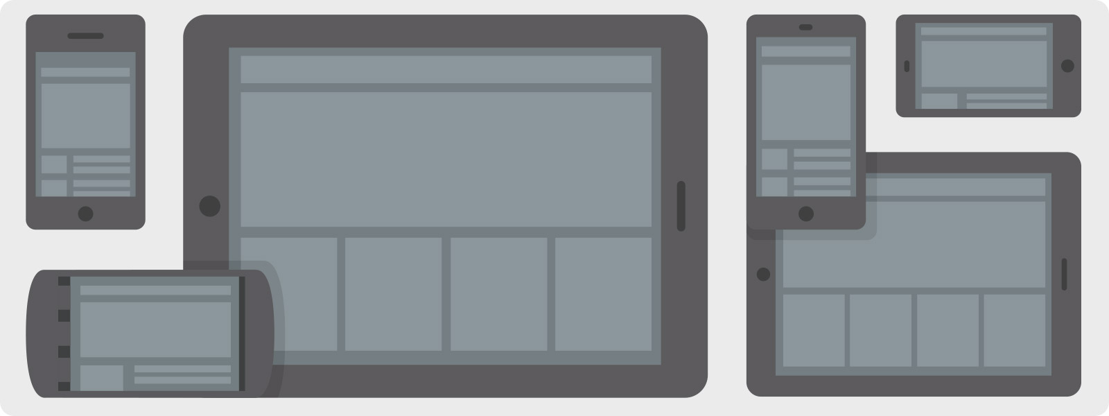
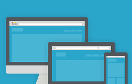
Mobile devices are already eclipsing desktops in adoption and internet use — that's why Foundation was built from the ground up to support any kind of device, any size screen, with any resolution. You can get going quickly by building once for all devices, or you can create a site tailored to a specific experience. We've even included CSS styles to hide and show elements on different device types, so you can easily turn pieces on and off for each experience.
View the docsExamples
Need to Learn More About Foundation?
Get your team up and running on Foundation with our online training courses!

Intro to Foundation
An introductory implementation-focused class on learning the fundamentals of using Foundation.

Advanced Foundation
An implementation-focused course on kicking your Foundation skills up a notch.
Custom Foundation Training
Learn the right design skills to move your business forward.