How people are using Foundation to build responsive, future-friendly sites.
Flite
Foundation was the way to go.
When online advertising tech firm Flite needed to do a redesign of its website, it knew that it had to work on any device, not just desktops. So the company looked around for a responsive framework. George Penston, VP of Product Design, had been following all that we do at ZURB and knew that the company had to take a look at Foundation to meet its needs. Foundation integrated well with Sass and Compass, something Flite has made essential to its development toolkit. While there were other frameworks out there, George said that Foundation was the way to go.
For the folks at Flite, Foundation had a nice, complete package with all the buttons and forms that they needed. As Andy Yang, Principal UX Designer, put it:
"Getting up to speed was super easy"
Andy had Foundation up and running in a day. Then it was just a matter of building out the entire site, which took about another two weeks.
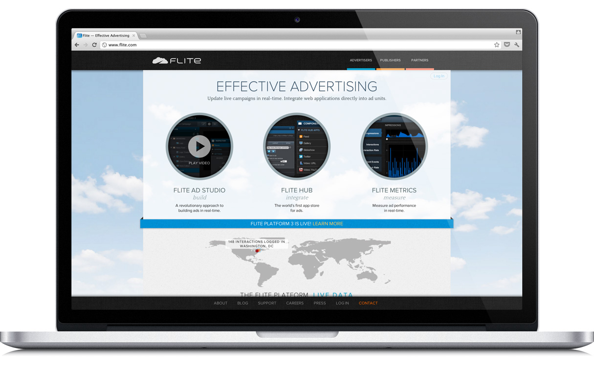
Integrating Their Design with Foundation
Flite started the design work on the site before deciding to use Foundation. The company had already solidified the design for their site. However, they didn't have much trouble backing the design into Foundation's framework. Not only that but Flite was able to integrate Foundation into its Sass+Compass workflow. George told us that was a real boon for the team.
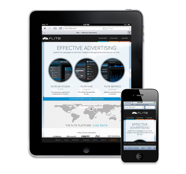
Retina display? No problem.
Preparing for the new iPad and its retina display ahead of time, the folks at Flite added retina support for key graphical elements into their SCSS/CSS. Take a look to see how they did it:
Would Use Again
In the end, the new site looked fantastic on all devices thanks to Foundation. Flite found a new tool that easily integrates with the other tools, such as Sass and Compass, in its toolbox. And the team would use Foundation again.
"Overall, I would definitely use it again for other projects."Andy