How people are using Foundation to build responsive, future-friendly sites.
Swizzle
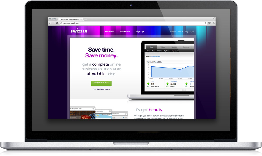
Beautiful, and built in the browser.
We were thrilled to see this site for Swizzle, an online service and design studio in Canada. Built on Foundation, it's not only beautiful, but scales in incredibly smart ways. Check it out on your desktop or mobile device to see what we mean, or read below what Laura Hutchinson from Swizzle said about how Foundation helped and what they have in store next.
Built in the Browser
Using Foundation, we were able to quickly implement the desktop and mobile site. It was easy to setup the shell how we wanted because the overall width is customizable, and it was fun to experiment with different layouts on the fly using the built-in responsive grid.

Device-Specific Navigation
We used Foundation's mobile visibility classes to hide the top navigation from mobile devices, and replace it with a menu link (the menu link is hidden from desktops with the visibility classes too). The link anchors to the footer navigation, which uses a bit of CSS to change the layout.
Next Steps: Client Friendly
What's next is to switch our client portal over to using Foundation. We've got lots of forms in our client portal, and until now they've been a real headache to style. We're also going to use Reveal for some great interactive features.