How people are using Foundation to build responsive, future-friendly sites.
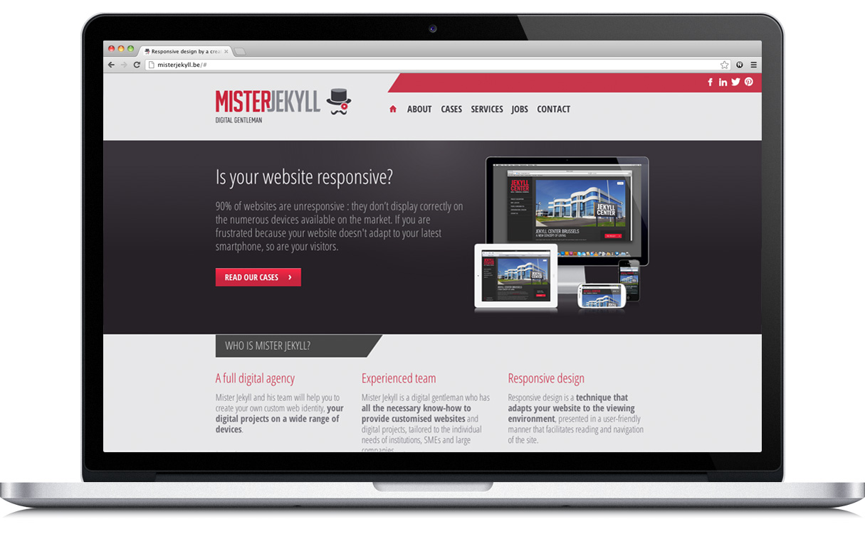
Mister Jekyll
A Matter of Opportunity
Mister Jekyll, a digital design firm in Brussels, knew that designing websites with a "pixel-perfect mind" was an outdated concept. They knew that it was time to think differently about their craft. Because more and more people are turning to mobile to access the web, it was clear that responsive design was the way to go.
As Clement Norterdaem, chief technical officer, put it:
"Responsive design, using new web standards like HTML5 and CSS3, is the ultimate solution in our opinion."
That's what prompted them to turn to Foundation, which they preferred over other responsive frameworks. The solid and thorough documentation played a major role in their decision, as well. The firm also really preferred the Sass implementation. As Clement said:
"It's also a matter of opportunity. We tested it and we just liked it, so why change?"
SCSS Was Useful
Clement said they found the Scss file adjust settings to be a very useful feature. However, they had hit a stumbling block when it came to the typography. The first webfont they used was problematic when it came to line-height, letter spacing and aspects on smaller screens. During the final steps, they had to change the webfont and adapt the CSS sizes and spaces using media queries. Like so:
A Great Framework for Everyone
While the company's site took about three weeks to build, Mister Jekyll plans to continue using Foundation because it was a full success. In Clement's own words:
"It is thus obvious that we will continue to use this great framework, for us and for our customers!"