How people are using Foundation to build responsive, future-friendly sites.
Jacqueline West, Author
A Responsive World
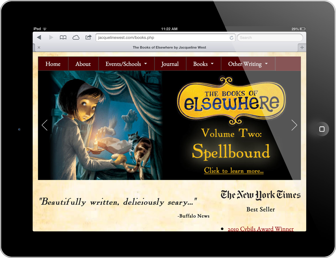
When eleven-year-old Olive Dunwoody moves into the old stone house on Linden Street, she soon discovers a mystic world that lies within the antique paintings hanging in her new home. The moment Olive enters one of the paintings, she is whisked away to danger and mystery that spans a series of fantasy books for young readers.
In a way, the paintings that young Olive encounters aren't unlike a responsive website — an entire world that's able to collapse into a neat little frame. So it seems natural that when Jacqueline West, award-winning author of "The Books of Elsewhere," needed a site to showcase Olive's adventures, her husband, Ryan, turned to Foundation.

Ryan, who is "her guy" when it comes to web design, had been keeping a close eye on the responsive movement, including reading our A List Apart article on Foundation.
"This was the first time it really clicked for me."
Jacqueline has a huge mobile audience, an entire generation that's accustomed to using Kindles and other tablet readers. So it "made sense to have a site that works for them," said Ryan.

Remarkably Smooth
Despite not being web savvy, Jacqueline got in on the action once she saw what Foundation had to offer. Ryan said she even sketched out how the content could fit on the various devices.
Ryan said he found the actual pieces of Foundation to be "remarkably smooth." He added that the documentation was also a great reference to keep him from getting too lost.
Piquing the Interest of Other Authors
Ryan said other authors and Jacqueline's publisher, Penguin, have been very pleased with the responsive site. He added that it's nice to see other authors interested in responsive design.