How Materiell Built a School Website That People Actually Want to Use
Article by ZURB Foundation Team on Feb 23
Yeti Takeaways TL;DR
40
unique microsites,
1 shared information architecture
27%
of traffic on mobile
508
(accessibility) compliance out of the box
The Challenge
School websites are notorious for being difficult to use, inconsistent, and pretty spartan when it comes to visuals. In many cases, they’re built from pieces designed to serve completely different purposes, cobbled together to try and meet rapidly changing needs. Mobile is lucky to be an afterthought, if a thought at all. But the the award winning team at Materiell using the Foundation framework have completely smashed those stereotypes and designed a new site that’s intuitive, fully accessible, and dare we say, even fun to use.
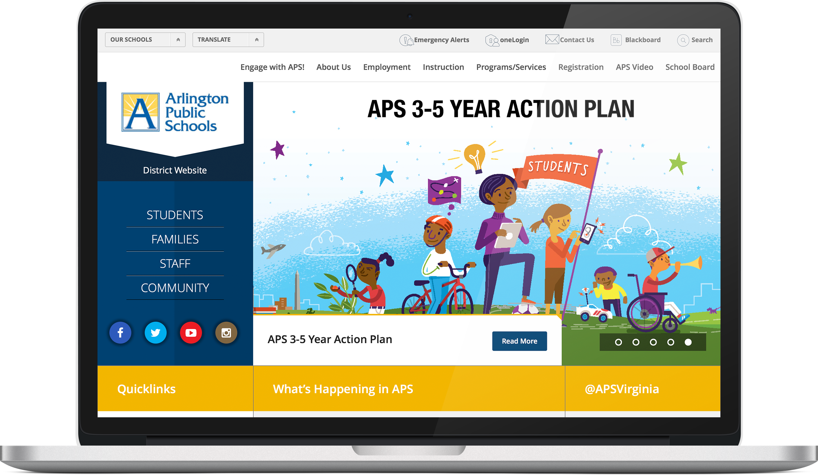
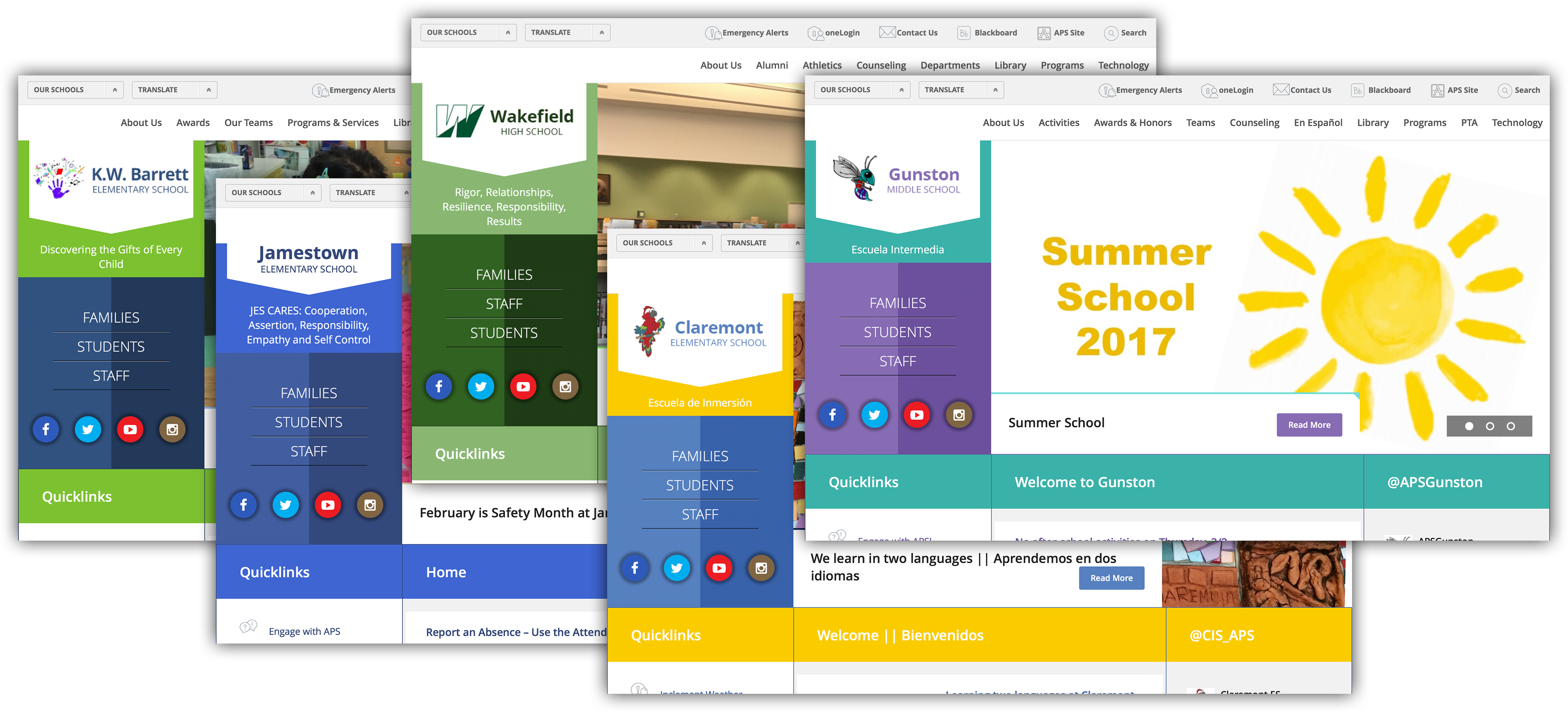
In Spring of 2015, the Arlington Public School (APS) district in Arlington, VA found themselves in the same position as many others. The websites of the near 40 schools in their district were extremely inconsistent, difficult to use on mobile, always out of sync, and their backend content management system was almost impossible to maintain. But they realized that just because that’s how things are, didn’t mean they had to stay that way. Overall, the site had to improve user friendliness, consistency, and ease of navigation. Being a government website, the site had an additional significant and sometimes challenging requirement: the site had to be 508 compliant (Accessible to those with disabilities) across the board.
Addressing The Problem:
Transforming a large, complex, government website into a user-friendly, responsive, and accessible one is a lofty challenge, but APS found the perfect partner in Materiell. Materielle is an award-winning design and development agency based in the Washington DC area that has a long history of working on education and governmental websites. This experience, combined with their expertise of both Foundation and Wordpress made the decision of which agency to work with a no brainer for the APS team and they got straight to work.
We discovered an incredibly wide spectrum of technical and software experience amongst the client staff team that will be responsible for managing web content. It ranged from Google Education certified to 'how do I add a link?' And we learned that they had conformed to a system and made it work the way they needed it to work, to the point that they were very dependent on that workflow. Deven Cao
Deven Cao is the creative director for Materiell, and he led the project from a design perspective. Working with a highly nontechnical audience presented some unique challenges, so they spent a lot of time up front doing wireframes, mocks, prototyping, and gathering feedback. This turned up a need to focus deeply on workflow.
As the project moved from prototyping into code, using Foundation was critical to keeping the project on schedule and solving the interface problems. Jeremy Englert, Materiell’s Foundation expert and all-star Project Manager noted that everyone in the project, design through development through launch, was familiar with Foundation. This shared understanding across all stages of the project eased a ton of tension, creating a smooth handoff all the way from design down.
Digging Into The Interface Layer
Most government websites follow a “function over form” ethos. People come to the site, not to be entertained or convinced to purchase, but to find the information they’re looking for. Utility is king, and while that was certainly true of the old APS sites, they were ignoring a growing segment of mobile users who couldn’t easily use the site. Using Foundation, this is where Materiell pulled off an incredible balancing act, keeping the site extremely functional while at same time making it much more visually appealing.
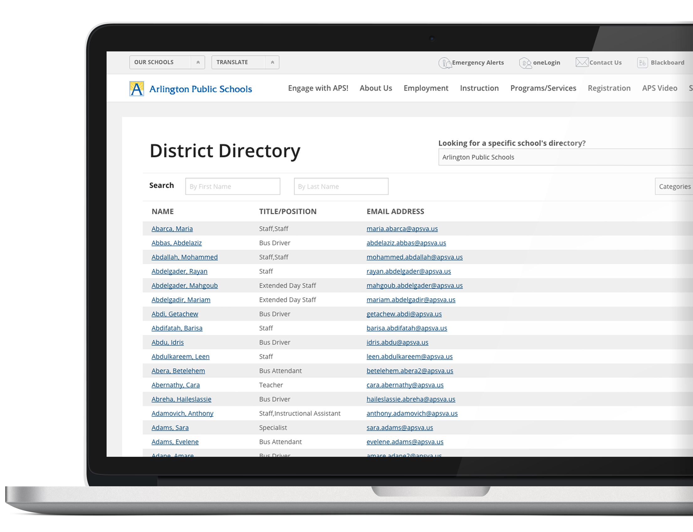
One of the best examples of this is in the staff directory. With over 2000 staff members distributed across close to 40 schools, this seemingly simple component encapsulates an incredibly complicated dataset into a clean, searchable, intuitive interface.
Today, a visitor to any of the APS microsites is able to quickly and easily find what they need. What’s more, as students move from elementary to middle to high school, the websites maintain a common information architecture even as they allow the brand to adjust to each individual school’s branding and colors.
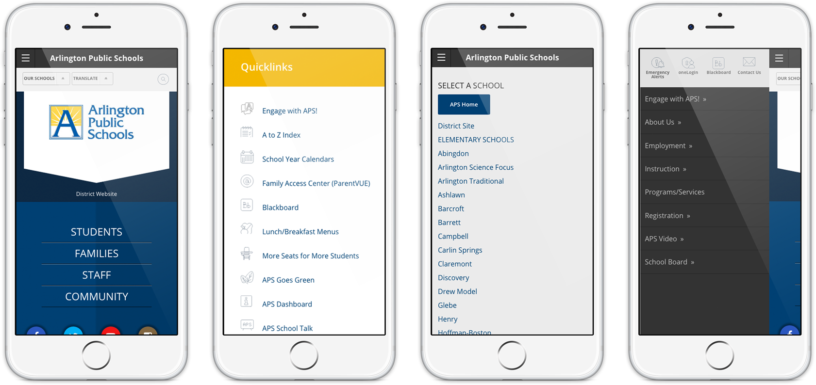
Having the Foundation navigation options definitely helped, especially down in mobile, where you’re still trying to get 20 to 30 different items into a manageable workflow. I think that navigation component was a huge timesaver for us. Jeremy Englert
The Result
Summer 2016 the new Arlington Public Schools system went live, and the response was immediate. After Materiell did training for staffmembers on the new backend for the website, they got feedback from their primary stakeholder like “Even employees who had doubts about the effectiveness of a new design were thrilled upon launch”. The newly responsive website was a big hit with parents on to go, with 27% of traffic now coming from mobile devices. And of course, being built on Foundation, the website was 100% 508 compliant. The overwhelming success of the APS family of sites is testament to the talent and ingenuity of the Materielle crew and the flexibility of the Foundation framework!
