MeUndies Uses Foundation to Build a World Class Shopping Experience
Article by ZURB Foundation Team on Jan 23
Yeti Takeaways (TL;DR)
60%
of MeUndies traffic is on a mobile device.
3 months
is all it took for MeUndies to rebuild their entire site using Foundation.
40%
increase in MeUndies' mobile conversion rate.
Rebuilding For a Mobile-First Audience
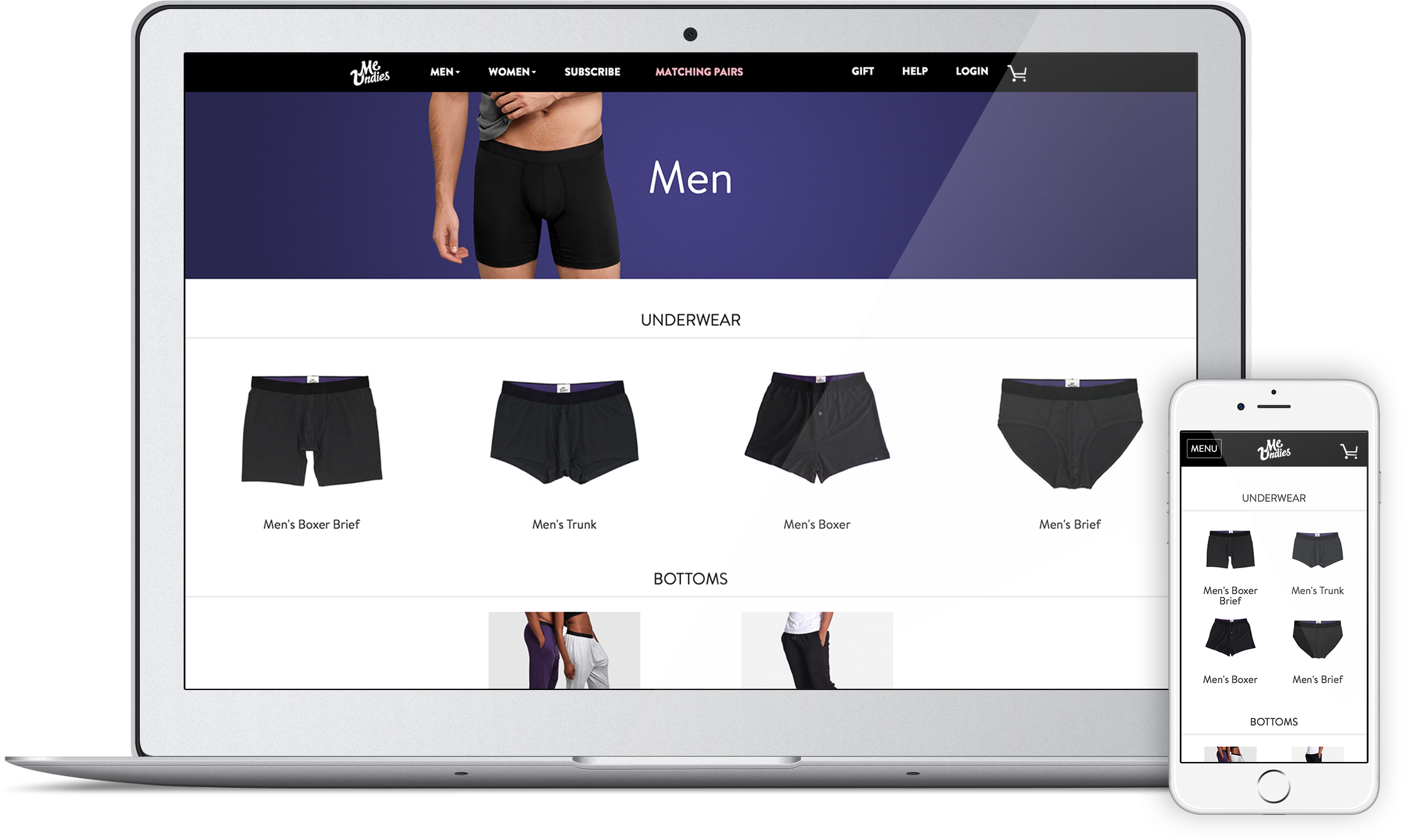
MeUndies is one of a new breed of online only retailers selling basics - a market that has attracted over $50 million dollars in Venture Capital over the last 5 years. When it comes to their underwear, they don’t compromise on quality and comfort. Their website reflects that pride in quality and user experience. Since they redesigned the site using Foundation, they’ve enjoyed a huge increase in mobile traffic, 40% increase in mobile conversion rate to sales, and a stylish site to be proud of.
The Challenge:
A Bone To Pick with Skeleton’s Mobile Support
In May 2014, MeUndies had a problem. As a social-media savvy brand active on Facebook, Instagram, and Twitter, they were seeing an increasing percentage of their traffic from mobile devices, but their site just wasn’t cutting it. Built using a fixed-width grid based on Skeleton, the site rendered poorly on small screens, and was not converting into sales. As a small, venture-backed startup, MeUndies needed each and every one of those sales. They needed a responsive solution, and they needed one fast.

Addressing The Problem:
Enter The Hero, Stage Left

Meet Justin Lalezarian, Software Engineer. Justin was brought onto the MeUndies team with the explicit goal of making the site responsive. Every quarter, MeUndies meets as a company and everyone is able to pitch ideas to execute on in the next 90 days. Justin quickly proposed rebuilding using Foundation.
After evaluating the options and determining what was at stake, the decision was made and the team moved quickly. The flexibility of Foundation allowed the MeUndies team to migrate the entire website in just 3 months without doing a complete rewrite. Since Skeleton was based on Foundation, Justin went into the Foundation codebase, namespaced all the Foundation classes — foundation-row, foundation-columns, then when he felt the layout was set, removed all the Skeleton classes and the foundation-namespacing. Great idea!
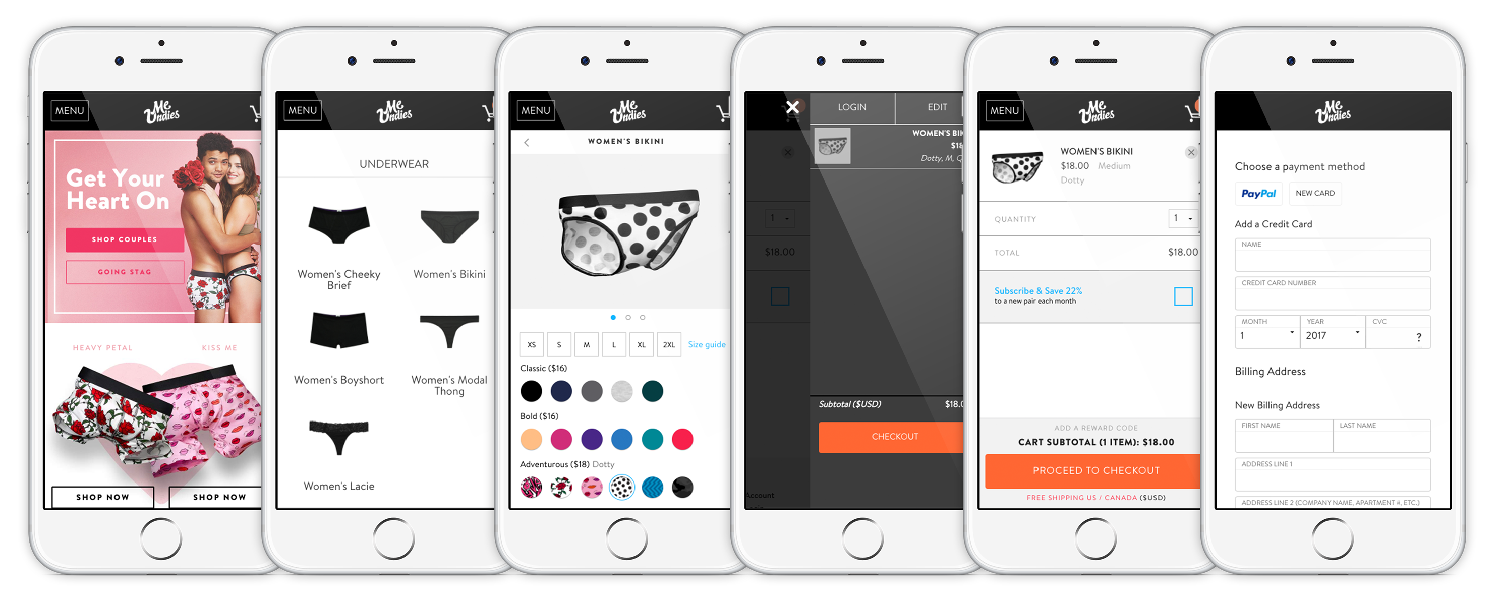
From there, the engineers worked closely with their marketing and sales team to try new features. Foundation helped them mock up new interactions with less time and effort spent creating components from scratch. As a result, they were able to iterate quickly and solve challenging problems like how to fit images, sizing, and color choices all within a single mobile product page.
Every day the site wasn’t responsive was a day lost. Because I had worked with Foundation, I felt most comfortable with it and getting into anything else would have cost us time. Justin Lalezarian
Boxers or Briefs:
A Brief Look at the Underlying UI
This video illustrates some of the thinking that went into making a very usable interface for picking a product on mobile. Making it simple to swap between versions and choose a size was paramount. Because there are so many color options, they are using a clever Block Grid to display them all based on the size chosen. When an item is added to the cart, a multilevel Foundation Off-canvas pops open and is used as a shopping cart. It makes it super simple to edit the cart or move on to buy.
Using several Foundation components to achieve useful interfaces through the site saved Meundies immense amounts of time and resources. Another component that came in handy was the Foundation Reveal modal which was modified to create a responsive address book allowing a quick checkout process on any device.
Because Foundation is so robust and has so many tools, it let us be really creative and think of cool ideas. There were a lot of times the Foundation toolbox offered a solution to our problems. Justin Lalezarian
The Result:
Mo Undies for Everyone!
In August 2014 the MeUndies site relaunched, rewritten using Foundation 5, and they haven’t looked back. Mobile sales immediately jumped, with conversion rates rising 40% between May 2014 and May 2015. Mobile traffic continued to skyrocket, to the point where today over 60% of MeUndies traffic is on a mobile device. And the MeUndies team continues to evolve their website every day, constantly A/B testing and improving to create the best possible user experience, and since the relaunch, they’re able to build and iterate at top speed, knowing that they’re building on a solid Foundation.


