Orbit
Orbit is an easy, powerful, responsive image slider that allows users to swipe on touch-enabled devices.
-
 Caption One.
 -
 Caption Two.
 -
 Caption Three.
Deprecation Notice:
Orbit has been deprecated, meaning that it is no longer supported. There's no need to worry though as we decided to leave it in Foundation if you choose to continue using it. We explain it here.
There are other great options if you need an image slider. A lot of them have features based on Orbit and may have added one of two more features.
This image slider is really slick: Slick Carousel. It has all the features Orbit has and can also be used as a carousel for single image sliding. It's easy to set up and is well supported.
Orbit is also not accessible to screen readers or assistive devices.
How to Setup Orbit
Orbit requires minimal HTML markup to function. Our Javascript takes care of most of the heavy lifting for you. The only thing you need to do is add a <ul data-orbit></ul> element to your page. You can then populate it with images, text, and captions. Here's the markup required to implement a basic Orbit slider on your page:
HTML
<ul class="example-orbit" data-orbit>
<li>
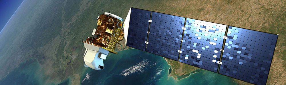
<img src="../assets/img/examples/satelite-orbit.jpg" alt="slide 1" />
<div class="orbit-caption">
Caption One.
</div>
</li>
<li class="active">
<img src="../assets/img/examples/andromeda-orbit.jpg" alt="slide 2" />
<div class="orbit-caption">
Caption Two.
</div>
</li>
<li>
<img src="../assets/img/examples/launch-orbit.jpg" alt="slide 3" />
<div class="orbit-caption">
Caption Three.
</div>
</li>
</ul>Rendered HTML
<div class="orbit-container">
  <ul data-orbit class="example-orbit orbit-slides-container">
    <li>
      <img src="../assets/img/examples/satelite-orbit.jpg" alt="slide 1" />
      <div class="orbit-caption">
        Caption One.
      </div>
    </li>
    <li class="active">
      <img src="../assets/img/examples/andromeda-orbit.jpg" alt="slide 1" />
      <div class="orbit-caption">
        Caption Two.
      </div>
    </li>
    <li>
      <img src="../assets/img/examples/launch-orbit.jpg" alt="slide 1" />
      <div class="orbit-caption">
        Caption Three.
      </div>
    </li>
  </ul>

  <!-- Navigation Arrows -->
  <a href="#" class="orbit-prev">Prev <span></span></a>
  <a href="#" class="orbit-next">Next <span></span></a>

  <!-- Slide Numbers -->
  <div class="orbit-slide-number">
    <span>1</span> of <span>3</span>
  </div>

  <!-- Timer and Play/Pause Button -->
  <div class="orbit-timer">
    <span></span>
    <div class="orbit-progress"></div>
  </div>
</div>

<!-- Bullets -->
<ol class="orbit-bullets">
  <li data-orbit-slide-number="1"></li>
  <li data-orbit-slide-number="2" class="active"></li>
  <li data-orbit-slide-number="3"></li>
</ol>
Content Sliders
Orbit can also be used with just content and no images.
HTML
<ul class="example-orbit-content" data-orbit>
  <li data-orbit-slide="headline-1">
    <div>
      <h2>Headline 1</h2>
      <h3>Subheadline</h3>
    </div>
  </li>
  <li data-orbit-slide="headline-2">
    <div>
      <h2>Headline 2</h2>
      <h3>Subheadline</h3>
    </div>
  </li>
  <li data-orbit-slide="headline-3">
    <div>
      <h2>Headline 3</h2>
      <h3>Subheadline</h3>
    </div>
  </li>
</ul>
Rendered HTML
-
Headline 1
Subheadline
-
Headline 2
Subheadline
-
Headline 3
Subheadline
Deep Linking
To link to a particular slide in your Orbit slider you will need to add a data-orbit-slide attribute to each slide. Then anywhere on your page you can use data-orbit-link to link to that slide.
HTML
<a data-orbit-link="headline-1" class="small button">
  Goto Slide 1
</a>
<a data-orbit-link="headline-2" class="small button">
  Goto Slide 2
</a>
<a data-orbit-link="headline-3" class="small button">
  Goto Slide 3
</a>
Rendered HTML
Goto Slide 1 Goto Slide 2 Goto Slide 3-
Headline 1
Subheadline
-
Headline 2
Subheadline
-
Headline 3
Subheadline
Accessibility
This component is not yet accessible. Stay tuned for updates in future releases.
Customize with Sass
We've included a bunch of variables that you'll be able to use if you're into getting SASSy with things.
$include-html-orbit-classes: $include-html-classes !default;

// We use these to control the caption styles
$orbit-container-bg: none !default;
$orbit-caption-bg: rgba(51,51,51, 0.8) !default;
$orbit-caption-font-color: $white !default;
$orbit-caption-font-size: rem-calc(14) !default;
$orbit-caption-position: "bottom" !default; // Supported values: "bottom", "under"
$orbit-caption-padding: rem-calc(10 14) !default;
$orbit-caption-height: auto !default;

// We use these to control the left/right nav styles
$orbit-nav-bg: transparent !default;
$orbit-nav-bg-hover: rgba(0,0,0,0.3) !default;
$orbit-nav-arrow-color: $white !default;
$orbit-nav-arrow-color-hover: $white !default;

// We use these to control the timer styles
$orbit-timer-bg: rgba(255,255,255,0.3) !default;
$orbit-timer-show-progress-bar: true !default;

// We use these to control the bullet nav styles
$orbit-bullet-nav-color: $iron !default;
$orbit-bullet-nav-color-active: $aluminum !default;
$orbit-bullet-radius: rem-calc(9) !default;

// We use these to controls the style of slide numbers
$orbit-slide-number-bg: rgba(0,0,0,0) !default;
$orbit-slide-number-font-color: $white !default;
$orbit-slide-number-padding: rem-calc(5) !default;

// Graceful Loading Wrapper and preloader
$wrapper-class: "slideshow-wrapper" !default;
$preloader-class: "preloader" !default;

// Hide controls on small
$orbit-nav-hide-for-small: true !default;
$orbit-bullet-hide-for-small: true !default;
$orbit-timer-hide-for-small: true !default;
Configuring Orbit
It's easy to configure Orbit using our provided Javascript. You can use with data-attributes or plain old Javascript. Make sure jquery.js, foundation.js, and foundation.orbit.js have been included on your page before continuing. For example add the following before the closing <body> tag:
<script src="js/vendor/jquery.js"></script>
<script src="js/foundation/foundation.js"></script>
<script src="js/foundation/foundation.orbit.js"></script>
Basic
Using data-attributes is the preferred method of making changes to our Javascript.
<ul data-orbit data-options="animation_speed:1500;">
  ...
</ul>
Advanced
You can also adjust settings using plain old Javascript. Here's all the available settings:
JS
$(document).foundation({
  orbit: {
      animation: 'slide', // Sets the type of animation used for transitioning between slides, can also be 'fade'
      timer_speed: 10000, // Sets the amount of time in milliseconds before transitioning a slide
      pause_on_hover: true, // Pauses on the current slide while hovering
      resume_on_mouseout: false, // If pause on hover is set to true, this setting resumes playback after mousing out of slide
      next_on_click: true, // Advance to next slide on click
      animation_speed: 500, // Sets the amount of time in milliseconds the transition between slides will last
      stack_on_small: false,
      navigation_arrows: true,
      slide_number: true,
      slide_number_text: 'of',
      container_class: 'orbit-container',
      stack_on_small_class: 'orbit-stack-on-small',
      next_class: 'orbit-next', // Class name given to the next button
      prev_class: 'orbit-prev', // Class name given to the previous button
      timer_container_class: 'orbit-timer', // Class name given to the timer
      timer_paused_class: 'paused', // Class name given to the paused button
      timer_progress_class: 'orbit-progress', // Class name given to the progress bar
      slides_container_class: 'orbit-slides-container', // Class name given to the slide container
      preloader_class: 'preloader', // Class given to the preloader
      slide_selector: 'li', // Default is '*' which selects all children under the container
      bullets_container_class: 'orbit-bullets',
      bullets_active_class: 'active', // Class name given to the active bullet
      slide_number_class: 'orbit-slide-number', // Class name given to the slide number
      caption_class: 'orbit-caption', // Class name given to the caption
      active_slide_class: 'active', // Class name given to the active slide
      orbit_transition_class: 'orbit-transitioning',
      bullets: true, // Does the slider have bullets visible?
      circular: true, // Does the slider should go to the first slide after showing the last?
      timer: true, // Does the slider have a timer active? Setting to false disables the timer.
      variable_height: false, // Does the slider have variable height content?
      swipe: true,
      before_slide_change: noop, // Execute a function before the slide changes
      after_slide_change: noop // Execute a function after the slide changes
  }
});
Real World Example
Here's an example of a customized Orbit container.
Javascript
$(document).foundation({
  orbit: {
    animation: 'slide',
    timer_speed: 1000,
    pause_on_hover: true,
    animation_speed: 500,
    navigation_arrows: true,
    bullets: false
  }
});
HTML
Events
There are several events that you can bind to in Orbit. Here's an example of how you can bind to these events:
HTML
<ul id="featured1" data-orbit>
  ...
</ul>
JS
$("#featured1").on("ready.fndtn.orbit", function(event) {
  console.info("ready");
});
$("#featured1").on("before-slide-change.fndtn.orbit", function(event) {
  console.info("before slide change");
});
$("#featured1").on("after-slide-change.fndtn.orbit", function(event, orbit) {
  console.info("after slide change");
  console.info("slide " + orbit.slide_number + " of " + orbit.total_slides);
});
$("#featured1").on("timer-started.fndtn.orbit", function(event, orbit) {
  console.info("timer started");
});
$("#featured1").on("timer-stopped.fndtn.orbit", function(event, orbit) {
  console.info("timer stopped");
});
Adding New Content After Page Load
If you add new content after the page has been loaded, you will need to reinitialize the Foundation JavaScript by running the following:
$(document).foundation();Reflow will make Foundation check the DOM for any elements and re-apply any listeners to them.
$(document).foundation('orbit', 'reflow');Sass Errors?
If the default "foundation" import was commented out, then make sure you import this file:
SCSS
@import "foundation/components/orbit";