How to Use Foundation Sass
Customizing your project with Foundation is easy, we recommend making different changes in different files which we will go over here.
_settings.scss
You will want to make changes to the settings file which includes tons of variables here that can be customized for each component.
Making changes is simple, in _settings.scss find the element you want to style (command/ctrl+f). Find the variable, uncomment the style, and change its value. Be sure to run grunt (libsass) or compass watch (compass) in order see any changes.
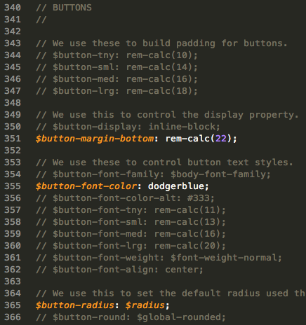
Here we've made some example changes to the buttons.
- First, we changed the margin on the bottom of the buttons.
- Next the colors have been changed to snazzy, dodger blue.
- Finally, we changed the radius on the corners.
Now just need to save your changes and your Sass will compile. Just refresh the page to see yours changes!
Mixins
We use mixins to allow you to create your own components based on underlying Foundation styles.
A mixin lets you make groups of CSS declarations that you want to reuse throughout your site. You can even pass in values to make your mixin more flexible. You can create custom mixins to speed up development, another example regarding buttons:
// Example mixin for custom button

.custom-button-class {
    @include button($padding, $bg, $radius, $full-width, $disabled, $is-input);
    }
Here is an example of some variables you can customize:
// $padding - Used to build padding for buttons
Default: $button-med or rem-calc(12) $padding: 12px;
// Primary color set in settings file.
Default: $primary-color. $bg: orange;
// If true, set to button radius which is $global-radius or explicitly set radius amount in px (ex. $radius:10px).
Default:false. $radius: true;
// We can set $full-width:true to remove side padding extend width.
Default: false $full-width: false;
// We can set $disabled:true to create a disabled transparent button.
Default: false $disabled: false;
// $is-input - <input>'s and <button>'s take on strange padding. We added this to help fix that.
Default: false $is-input: false;
Then you can use your new custom button by simply include the following html:
<a href="#" class="custom-button-class">...</a>app.scss
All of your project styles should go in this file..
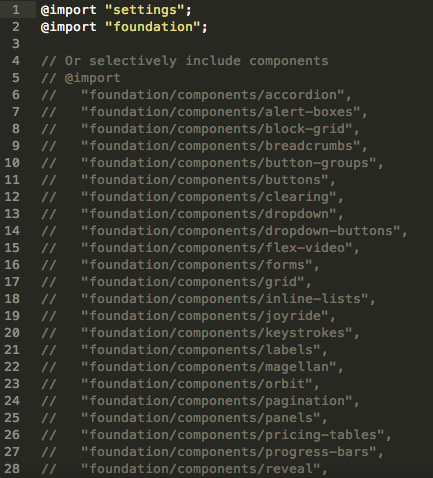
By default the _settings.scss is imported here - @import "settings" as well as all of Foundation SCSS - @import "foundation". If you don't want all of Foundation you can comment it out and then activate the individual imports you want below including the @import on line 5.
Note: Some Foundation components depend on other styles.
After the @import tag is a great place to keep your custom Sass because it will get compiled into CSS right from here.
.img-panel {
  position: relative;
  padding-left: 6rem;
  margin-bottom: 2rem;

  img {
    position: absolute;
    top: 1.7rem;
    left: -($panel-padding * 1.5);
    max-width: 6rem;
  }
}
Here is an example of how you can write Sass inside the app.scss file.
The Sass version of Foundation still allows you to write Vanilla CSS as well. If you want to do so, it is best practice to write these CSS styles in the app.scss file.
Note: Any CSS files in the stylesheets folder will be overwritten when your Sass is compiled, be sure keep any changes away from the files in this folder.