Base Typography
Typography in Foundation 6 is meant to make your life easier by providing clean, attractive, simple default styles for all of the most basic typographical elements.
Paragraphs
This is a paragraph. Paragraphs are preset with a font size, line height and spacing to match the overall vertical rhythm. To show what a paragraph looks like this needs a little more content—so, did you know that there are storms occurring on Jupiter that are larger than the Earth? Pretty cool. Use the <strong> and <em> tags to denote text that should be displayed or read with emphasis. Browsers will bold and italicize the words, while screen readers will read them with emphasis.
If the emphasis of a phrase is important, don't make the emphasis purely visual—use the <em> or <strong> tags to mark it as well. Both of these tags have built-in styles, but there's no harm in adding additional styles in specific contexts.

<p>This is a paragraph. Paragraphs are preset with a font size, line height and spacing to match the overall vertical rhythm. To show what a paragraph looks like this needs a little more content so, did you know that there are storms occurring on Jupiter that are larger than the Earth? Pretty cool. Wrap strong around type to <strong>make it bold!</strong>. You can also use em to <em>italicize your words</em>.</p>Header
Foundation includes styles for all headings—they're balanced and sized along a modular scale.
 Watch this part in video
Avoid skipping heading levels when structuring your document, as it confuses screen readers. For example, after using an <h2> in your code, the next heading used should be either <h2> or <h3>. If you need a heading to look bigger or smaller to match a specific style, use CSS to override the default size.
<h1>h1. This is a very large header.</h1>
<h2>h2. This is a large header.</h2>
<h3>h3. This is a medium header.</h3>
<h4>h4. This is a moderate header.</h4>
<h5>h5. This is a small header.</h5>
<h6>h6. This is a tiny header.</h6>
h1. This is a very large header.
h2. This is a large header.
h3. This is a medium header.
h4. This is a moderate header.
h5. This is a small header.
h6. This is a tiny header.
Header Styles
The framework includes two typographic scales—one uses a narrow range of sizes for small-sized screens, and the other uses a larger range of sizes for medium- and larger-sized screens. You can change these scales, or add new ones for other breakpoints, by editing the $header-styles map in your project's Settings File.
| Header | Default | Medium and up |
|---|---|---|
<h1> |
24px | 48px |
<h2> |
20px | 40px |
<h3> |
19px | 31px |
<h4> |
18px | 25px |
<h5> |
17px | 20px |
<h6> |
16px | 16px |
You can also adjust line height, margin top and margin bottom for each heading size by adding values in your Settings File.
In its most complete form the $header-styles map looks like this:
$header-styles: (
  'small': (
    'h1': ('font-size': 24, 'line-height': $header-lineheight, 'margin-top': 0, 'margin-bottom': $header-margin-bottom),
    'h2': ('font-size': 20, 'line-height': $header-lineheight, 'margin-top': 0, 'margin-bottom': $header-margin-bottom),
    'h3': ('font-size': 19, 'line-height': $header-lineheight, 'margin-top': 0, 'margin-bottom': $header-margin-bottom),
    'h4': ('font-size': 18, 'line-height': $header-lineheight, 'margin-top': 0, 'margin-bottom': $header-margin-bottom),
    'h5': ('font-size': 17, 'line-height': $header-lineheight, 'margin-top': 0, 'margin-bottom': $header-margin-bottom),
    'h6': ('font-size': 16, 'line-height': $header-lineheight, 'margin-top': 0, 'margin-bottom': $header-margin-bottom)
  ),
  'medium': (
    'h1': ('font-size': 48, 'line-height': $header-lineheight, 'margin-top': 0, 'margin-bottom': $header-margin-bottom),
    'h2': ('font-size': 40, 'line-height': $header-lineheight, 'margin-top': 0, 'margin-bottom': $header-margin-bottom),
    'h3': ('font-size': 31, 'line-height': $header-lineheight, 'margin-top': 0, 'margin-bottom': $header-margin-bottom),
    'h4': ('font-size': 25, 'line-height': $header-lineheight, 'margin-top': 0, 'margin-bottom': $header-margin-bottom),
    'h5': ('font-size': 20, 'line-height': $header-lineheight, 'margin-top': 0, 'margin-bottom': $header-margin-bottom),
    'h6': ('font-size': 16, 'line-height': $header-lineheight, 'margin-top': 0, 'margin-bottom': $header-margin-bottom)
  ),
  ...
);
Because this is a little bit lengthy we have also introduced a short form, that you can use alternatively:
$header-styles: (
  'small': (
    'h1': ('fs': 24, 'lh': $header-lineheight, 'mt': 0, 'mb': $header-margin-bottom),
    'h2': ('fs': 20, 'lh': $header-lineheight, 'mt': 0, 'mb': $header-margin-bottom),
    'h3': ('fs': 19, 'lh': $header-lineheight, 'mt': 0, 'mb': $header-margin-bottom),
    'h4': ('fs': 18, 'lh': $header-lineheight, 'mt': 0, 'mb': $header-margin-bottom),
    'h5': ('fs': 17, 'lh': $header-lineheight, 'mt': 0, 'mb': $header-margin-bottom),
    'h6': ('fs': 16, 'lh': $header-lineheight, 'mt': 0, 'mb': $header-margin-bottom)
  ),
  'medium': (
    'h1': ('fs': 48, 'lh': $header-lineheight, 'mt': 0, 'mb': $header-margin-bottom),
    'h2': ('fs': 40, 'lh': $header-lineheight, 'mt': 0, 'mb': $header-margin-bottom),
    'h3': ('fs': 31, 'lh': $header-lineheight, 'mt': 0, 'mb': $header-margin-bottom),
    'h4': ('fs': 25, 'lh': $header-lineheight, 'mt': 0, 'mb': $header-margin-bottom),
    'h5': ('fs': 20, 'lh': $header-lineheight, 'mt': 0, 'mb': $header-margin-bottom),
    'h6': ('fs': 16, 'lh': $header-lineheight, 'mt': 0, 'mb': $header-margin-bottom)
  ),
  ...
);
The values for 'font-size'/'fs', 'margin-top'/'mt' and 'margin-bottom'/'mb' are transformed into 'rem's. You can use any unit, but if you don't, we assume that you mean 'px'. If you do not set the keys 'font-size'/'fs' defaults to 1rem, 'margin-top'/'mt' to 0 and 'margin-bottom'/'mb' to $header-margin-bottom for size 'small'. Thereafter the values for a larger size are inherited from the values of the smaller size if no value is entered for a larger breakpoint.
The value for 'line-height'/'lh' is transformed into a unitless number, that expresses the line-height relative to the fonts-size. You can also input any unit. If you don't, we assume that for numbers smaller than or equal to 10, you mean a typical relative line-height. However, if you put in anything larger than 10, we assume you mean 'px', since we have not yet seen relative line-heights that were larger than 10. If you do not set 'line-height'/'lh' it defaults to $header-lineheight for size 'small'. Thereafter the value for a larger size is inherited from the values of the smaller size.
The `$header-styles` map has replaced `$header-sizes` map in version 6.3. `$header-styles` map is a more general map than `$header-sizes`.
`$header-sizes` map is still working and is used to initialize the `$header-styles` map. In version 6.4 the `$header-sizes` is going to be deprecated.
Small Header Segments
By inserting a <small> element into a header Foundation will scale the header font size down for an inline element, allowing you to use this for subtitles or other secondary header text.
<h3>Foundation for Sites <small>Version 6.6.1</small></h3>Foundation for Sites Version 6.6.1
Links
Links are very standard, and the color is preset to the Foundation primary color. Learn more about Foundation's global colors.
To make links screen reader-friendly, avoid using vague words like "here" or "read more" within link text. The text of the link itself should adequately describe where the link goes.
<p>Links are very standard, and the color is preset to the Foundation primary color. <a href="global.html">Learn more about Foundation's global colors.</a></p>Dividers
Use dividers to define thematic breaks between paragraphs. To denote the end of one section of a page and the start of another, it's better to use the <section> tag.
<hr>Unordered Lists
Use an unordered list to... list things, if the order of the items doesn't matter.
<ul>
  <li>List item with a much longer description or more content.</li>
  <li>List item</li>
  <li>List item
    <ul>
      <li>Nested list item</li>
      <li>Nested list item</li>
      <li>Nested list item</li>
    </ul>
  </li>
  <li>List item</li>
  <li>List item</li>
  <li>List item</li>
</ul>- List item with a much longer description or more content.
- List item
- List item
- Nested list item
- Nested list item
- Nested list item
- List item
- List item
- List item
Ordered Lists
<ol>
  <li>Cheese (essential)</li>
  <li>Pepperoni</li>
  <li>Bacon
    <ol>
      <li>Normal bacon</li>
      <li>Canadian bacon</li>
    </ol>
  </li>
  <li>Sausage</li>
  <li>Onions</li>
  <li>Mushrooms</li>
</ol>- Cheese (essential)
- Pepperoni
- Bacon
- Normal bacon
- Canadian bacon
- Sausage
- Onions
- Mushrooms
Definition Lists
A definition list (<dl>) is used to display name-value pairs, like metadata or a dictionary definition. Each term (<dt>) is paired with one or more definitions (<dd>).
<dl>
  <dt>Time</dt>
  <dd>The indefinite continued progress of existence and events in the past, present, and future regarded as a whole.</dd>
  <dt>Space</dt>
  <dd>A continuous area or expanse that is free, available, or unoccupied.</dd>
  <dd>The dimensions of height, depth, and width within which all things exist and move.</dd>
</dl>- Time
- The indefinite continued progress of existence and events in the past, present, and future regarded as a whole.
- Space
- A continuous area or expanse that is free, available, or unoccupied.
- The dimensions of height, depth, and width within which all things exist and move.
Blockquotes
Sometimes other people say smart things, and you may want to mention those things with a quote. We've got you covered.
<blockquote>
  Those people who think they know everything are a great annoyance to those of us who do.
  <cite>Isaac Asimov</cite>
</blockquote>
Those people who think they know everything are a great annoyance to those of us who do. Isaac Asimov
Abbreviations
Use the <abbr> tag to annotate a shortened term. Abbreviations must always have a title attribute which clarifies the full term.
<p>In my dream last night, I saw <abbr title="John Ronald Reuel">J. R. R.</abbr> Tolkien and George <abbr title="Raymond Richard">R. R.</abbr> Martin hanging out on Sunset <abbr title="Boulevard">Blvd</abbr>.</p>In my dream last night, I saw J. R. R. Tolkien and George R. R. Martin hanging out on Sunset Blvd.
Code
Format references to code with the <code> tag. In order for angle brackets <> to render correctly, you need to change them to < and >.
Remember to escape angle brackets when printing HTML: <code><div></code><div>Use .code-inline component to apply the code style when you want.
<span class="code-inline">I am not code, but I am displayed as if.</span>Use the .code-block component to create a block of code.
<code class="code-block">{
    "What I am": "I am a big chunk of code. I can have very long lines, I will not break and show a scrollbar instead.",
    ...
}</code>
{
"What I am": "I am a big chunk of code. I can have very long lines, I will not break and show a scrollbar instead.",
...
}It is recommended to use the appropriate semantic markup for your content (`` for code, `` for pre-formatted text). Styling classes `.code-inline` and `.code-block` should be used without semantic markup only if the content is NOT code/pre-formatted text but should be displayed as if.
Keystrokes
Use the <kbd> element to annotate a key stroke or combination.
<p>Press <kbd>Cmd+Q</kbd> (or <kbd>Ctrl+Q</kbd> on Windows) to play Half-Life 3.</p>Press Cmd+Q (or Ctrl+Q on Windows) to play Half-Life 3.
Accessibility
Text is core to the content of your page, so making it accessible to everyone is important. Here are some general guidelines to follow.
Text vs. Images
Prefer using actual text over text inside a graphic. Assistive technologies can't read an image, and the text in an image can't be resized by a browser, like normal text. If an image has text that needs to be read, add it in the alt attribute of the image.
<img src="assets/img/buy-now.jpg" alt="Buy now">Contrast
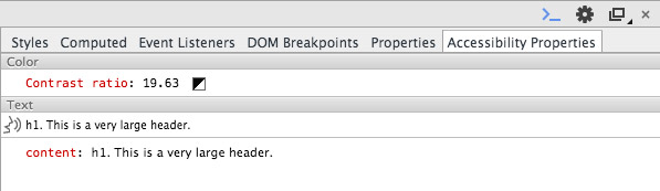
The contrast between the color of an element's text and its background should be high enough that low-vision users can read it. The minimum recommended contrast ratio is 4.5:1. There are no automated tools that can effectively check this for you, but if you aren't sure about a specific color combination, you can run it through one of many color contrast checkers, such as WebAIM's color contrast checker.
Google Chrome's Accessibility Developer Tools also includes a contrast checker. By selecting an element in the inspector, you can see if the contrast meets the minimum standards.
Type Size
When possible, use the rem and em units to size everything. Not just font size, but also padding, margins, and any length value. This ensures that your design scales up and down uniformly if the user changes their browser's text size. It's common for vision-impaired users to resize their browser up to 200% zoom.
We use the rem unit nearly everywhere in Foundation, and even wrote a Sass function to make it a little easier. The rem-calc() function can take one or more pixel values and convert them to proper rem values.
.element {
  width: rem-calc(300);
  padding: rem-calc(10 16);
}
More Resources
- WebAIM: Fonts
- WebAIM: Links and HyperText
- WebAIM: Writing Clearly and Simply
- WebAIM: Color Contrast Checker
Print Styles
Foundation includes print styles developed by HTML5 Boilerplate to give you some basic print-specific styles. These are activated when you print through a media query. It includes:
- Clearing out backgrounds, box shadows and text shadows
- Appending link URLs after the anchor text
- Adding borders to
<blockquote>and<pre>elements - Page cleanup and window minimization
On top of that, Foundation includes a couple of simple classes you can use to control elements printing, or not printing. Simply attach .show-for-print to an element to only show when printing, and .hide-for-print to hide something when printing.
Print styles use `!important` to ensure they aren't overridden by more specific selectors. This framework conscientiously avoids using `!important` declarations. This is one of the few components that does.
Sass Reference
Variables
The default styles of this component can be customized using these Sass variables in your project's settings file.
| Name | Type | Default Value | Description |
|---|---|---|---|
$print-transparent-backgrounds |
Boolean | true |
If |
$print-hrefs |
Boolean | true |
If |
$header-font-family |
String or List | $body-font-family |
Font family for header elements. |
$header-font-weight |
String | $global-weight-normal |
Font weight of headers. |
$header-font-style |
String | normal |
Font style (e.g. italicized) of headers. |
$font-family-monospace |
String or List | Consolas, 'Liberation Mono', Courier, monospace |
Font stack used for elements that use monospaced type, such as code samples |
$header-color |
Color | inherit |
Color of headers. |
$header-lineheight |
Number | 1.4 |
Line height of headers. |
$header-margin-bottom |
Number | 0.5rem |
Bottom margin of headers. |
$header-styles |
Map |
small: (
'h1': ('font-size': 24) |
Styles for headings at various screen sizes. Each key is a breakpoint, and each value is a map of heading styles. |
$header-text-rendering |
String | optimizeLegibility |
Text rendering method of headers. |
$small-font-size |
Number | 80% |
Font size of |
$header-small-font-color |
Color | $medium-gray |
Color of |
$paragraph-lineheight |
Number | 1.6 |
Line height of text inside |
$paragraph-margin-bottom |
Number | 1rem |
Bottom margin of paragraphs. |
$paragraph-text-rendering |
String | optimizeLegibility |
Text rendering method for paragraph text. |
$enable-code-inline |
Boolean | true |
Use the |
$anchor-color |
Color | $primary-color |
Default color for links. |
$anchor-color-hover |
Color | scale-color($anchor-color, $lightness: -14%) |
Default color for links on hover. |
$anchor-text-decoration |
String | none |
Default text decoration for links. |
$anchor-text-decoration-hover |
String | none |
Default text decoration for links on hover. |
$hr-width |
Number | $global-width |
Maximum width of a divider. |
$hr-border |
List | 1px solid $medium-gray |
Default border for a divider. |
$hr-margin |
Number or List | rem-calc(20) auto |
Default margin for a divider. |
$list-lineheight |
Number | $paragraph-lineheight |
Line height for items in a list. |
$list-margin-bottom |
Number | $paragraph-margin-bottom |
Bottom margin for items in a list. |
$list-style-type |
String | disc |
Bullet type to use for unordered lists (e.g., |
$list-style-position |
String | outside |
Positioning for bullets on unordered list items. |
$list-side-margin |
Number | 1.25rem |
Left (or right) margin for lists. |
$list-nested-side-margin |
Number | 1.25rem |
Left (or right) margin for a list inside a list. |
$defnlist-margin-bottom |
Number | 1rem |
Bottom margin for |
$defnlist-term-weight |
String | $global-weight-bold |
Font weight for |
$defnlist-term-margin-bottom |
Number | 0.3rem |
Spacing between |
$blockquote-color |
Color | $dark-gray |
Text color of |
$blockquote-padding |
Number or List | rem-calc(9 20 0 19) |
Padding inside a |
$blockquote-border |
List | 1px solid $medium-gray |
Side border for |
$enable-cite-block |
Boolean | true |
Use the |
$keystroke-font |
String or List | $font-family-monospace |
Font family for |
$keystroke-color |
Color | $black |
Text color for |
$keystroke-background |
Color | $light-gray |
Background color for |
$keystroke-padding |
Number or List | rem-calc(2 4 0) |
Padding for |
$keystroke-radius |
Number or List | $global-radius |
Border radius for |
$abbr-underline |
List | 1px dotted $black |
Bottom border style for |